
Hi, I'm Jake.
Nice to meet you.
I'm a self-starting designer who creates project opportunities through curiosity, initiative and a sharp eye for improvement. Whether it's a brand, product, or process, I'm here to make things work — and feel — better.
ADS:
Designing for Creative Identity
1. Problem
Alex's digital portfolio was static and disengaging. His work stood out, of course, but visitors — potential clients — were not prompted to engage. Alex had no clear service structure, no booking system and no pathway for client engagement and scalability. It wasn't reflecting the full potential of his work or attracting the level of clients he was ready for.
2. Approach
Working closely together, we aligned Alex's visual style with a practical, user-focused web experience. I led the digital strategy and site architecture, ensuring that the final product felt creatively authentic while supporting our business goals. We wanted to create something that felt like Alex, but worked like an agency.
Disclaimer: This video was recorded on a dodgy library connection
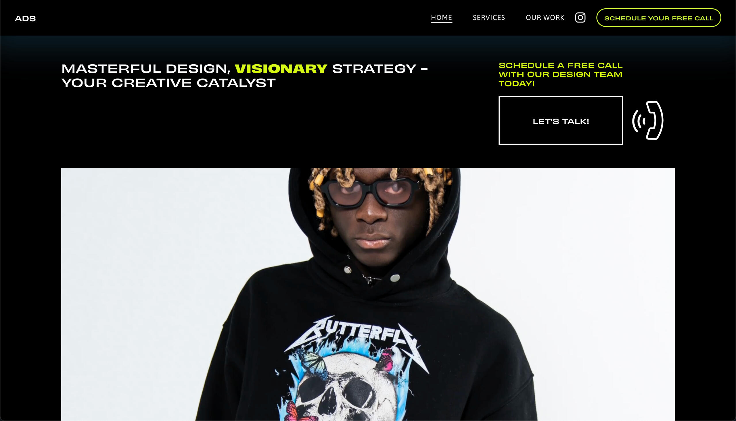
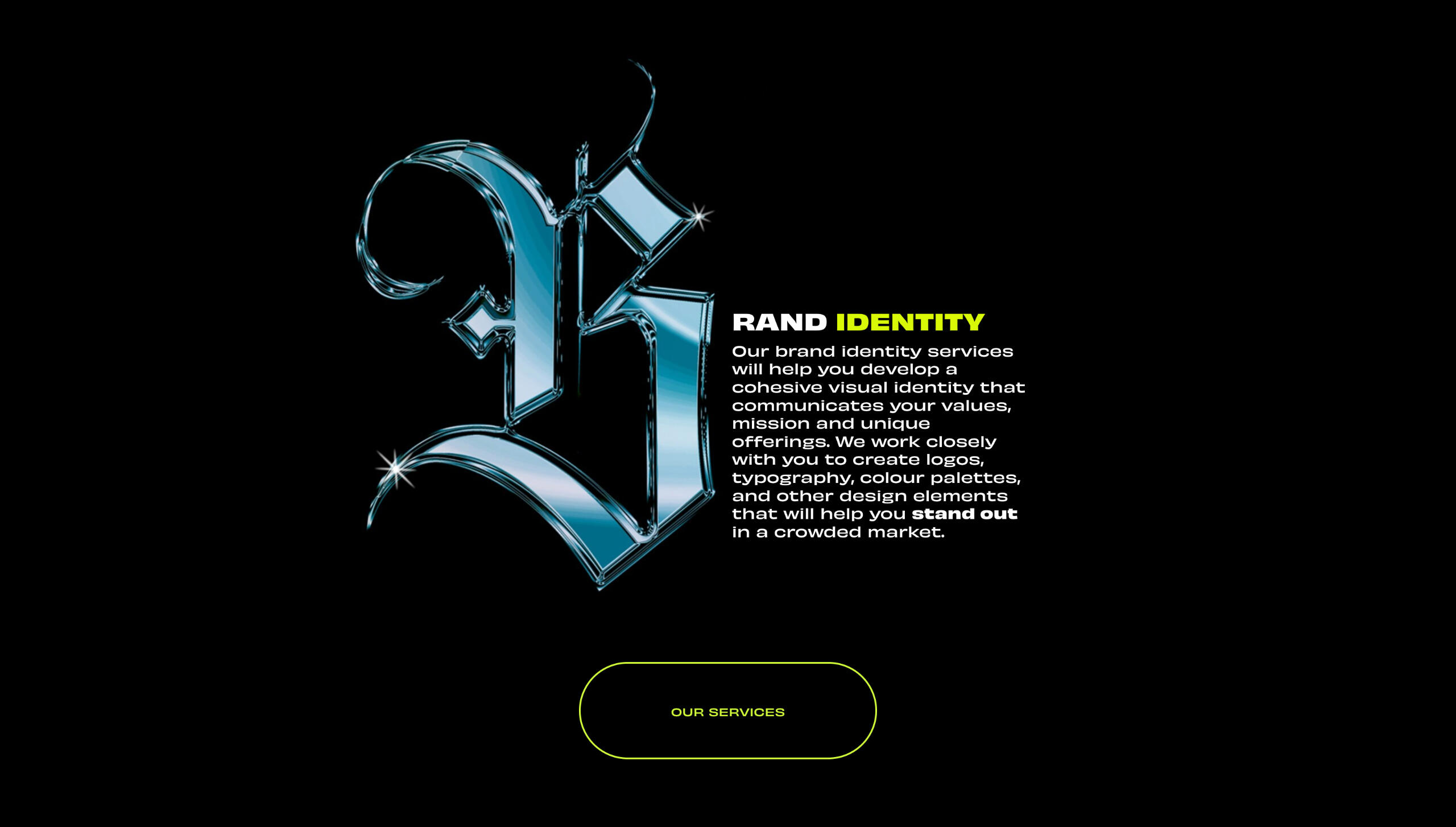
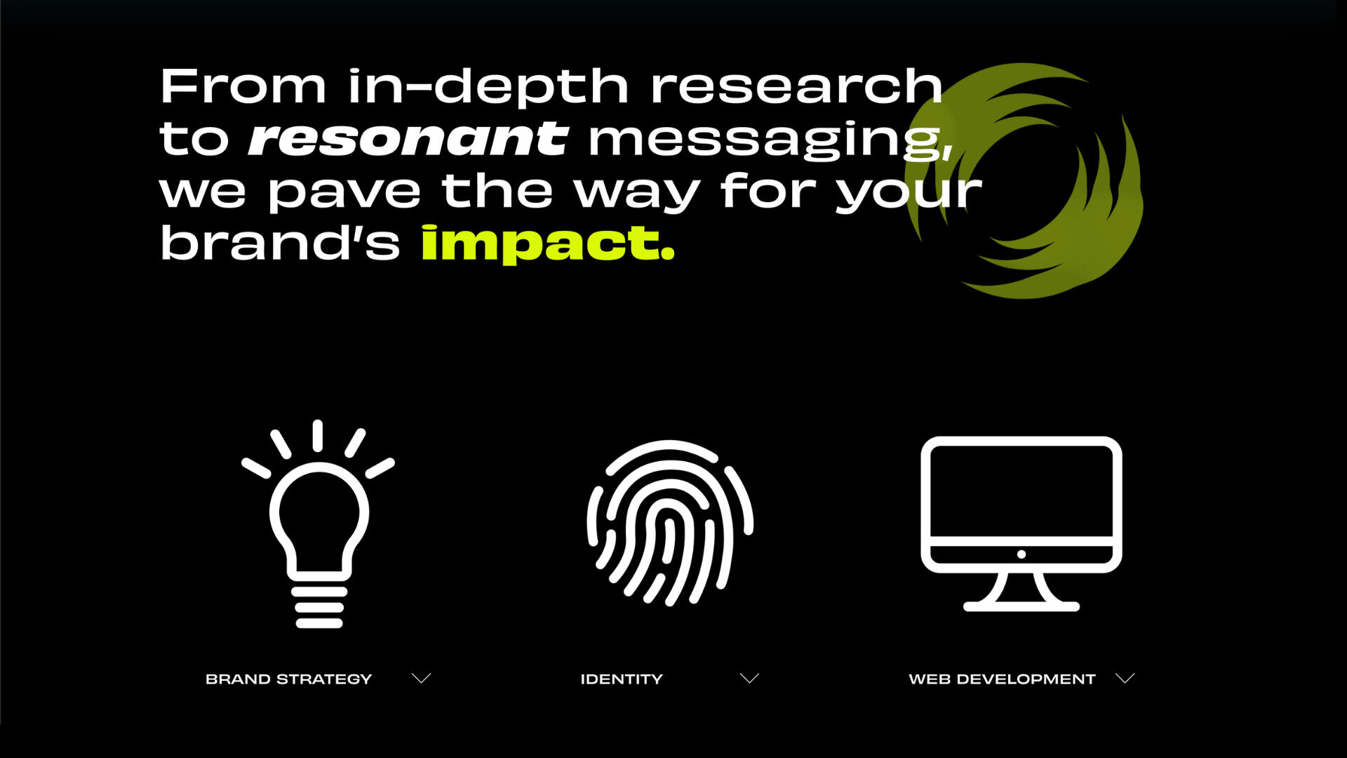

3. Solution
The redesign introduced a clear structure for services, smooth navigation, interactive sections, a booking system and copy that guided visitors toward action. Every element — from layout to language — was designed to bridge the gap between creativity and conversion, without compromising the brand's personality.
4. Outcome
The new site launched with strong early momentum, including a successful client project shortly after going live. While the agency vision wasn't pursued long-term, the project demonstrated what's possible when strong creative direction is paired with user-first web design — and highlighted my ability to turn creative potential into a functional, scalable digital experience.
Giant Coffee:
Website Design
1. Problem
Small hospitality businesses often lack an online ordering presence or ecommerce store, missing significant revenue opportunities and limiting customer engagement.
2. Approach
I designed a website concept for Giant Coffee — a boutique cafe in Perth, Western Australia — focusing on brand storytelling, emotional connection, and clear user pathways to drive online sales and in-store loyalty.
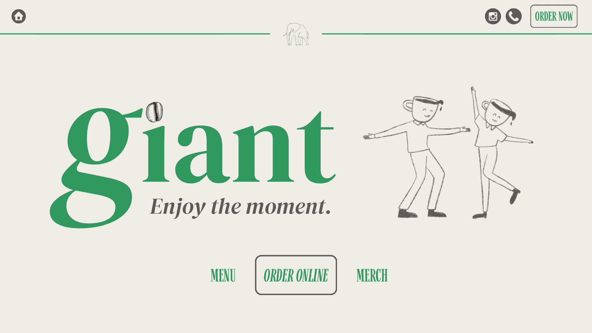
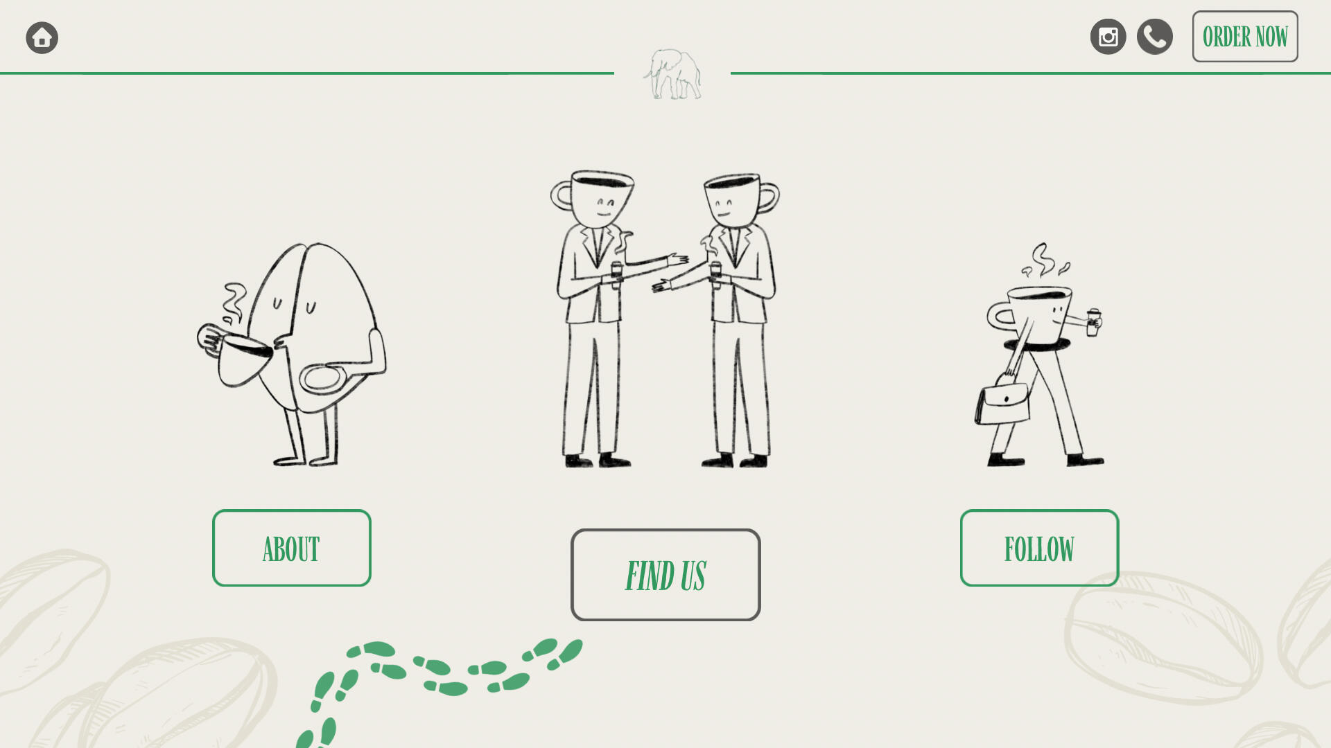
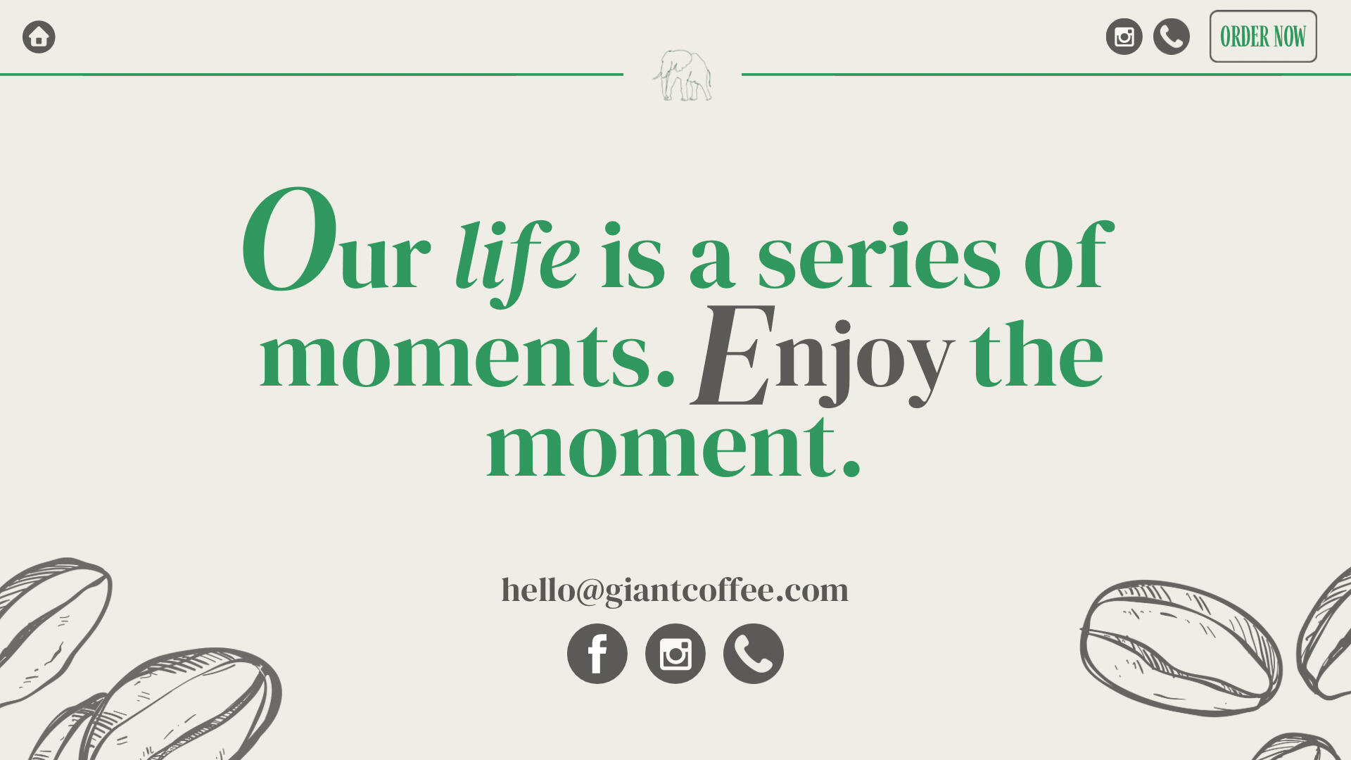
3. Solution
• Simplified landing page with priority Call To Actions (CTA) (Order, Menu, Merch)
• Playful but sophisticated branding style
• Clear navigation with easy to follow user pathways, and
• Emotional engagement through the use of illustrations and consistent brand messaging.
4. Outcome
Presented to the client, highlighting potential for online growth, customer loyalty programs, and future product expansion. Although not implemented, the project demonstrates my ability to create business-centred, strategic, emotionally intelligent user experiences.
Council Rates Assessment Notice
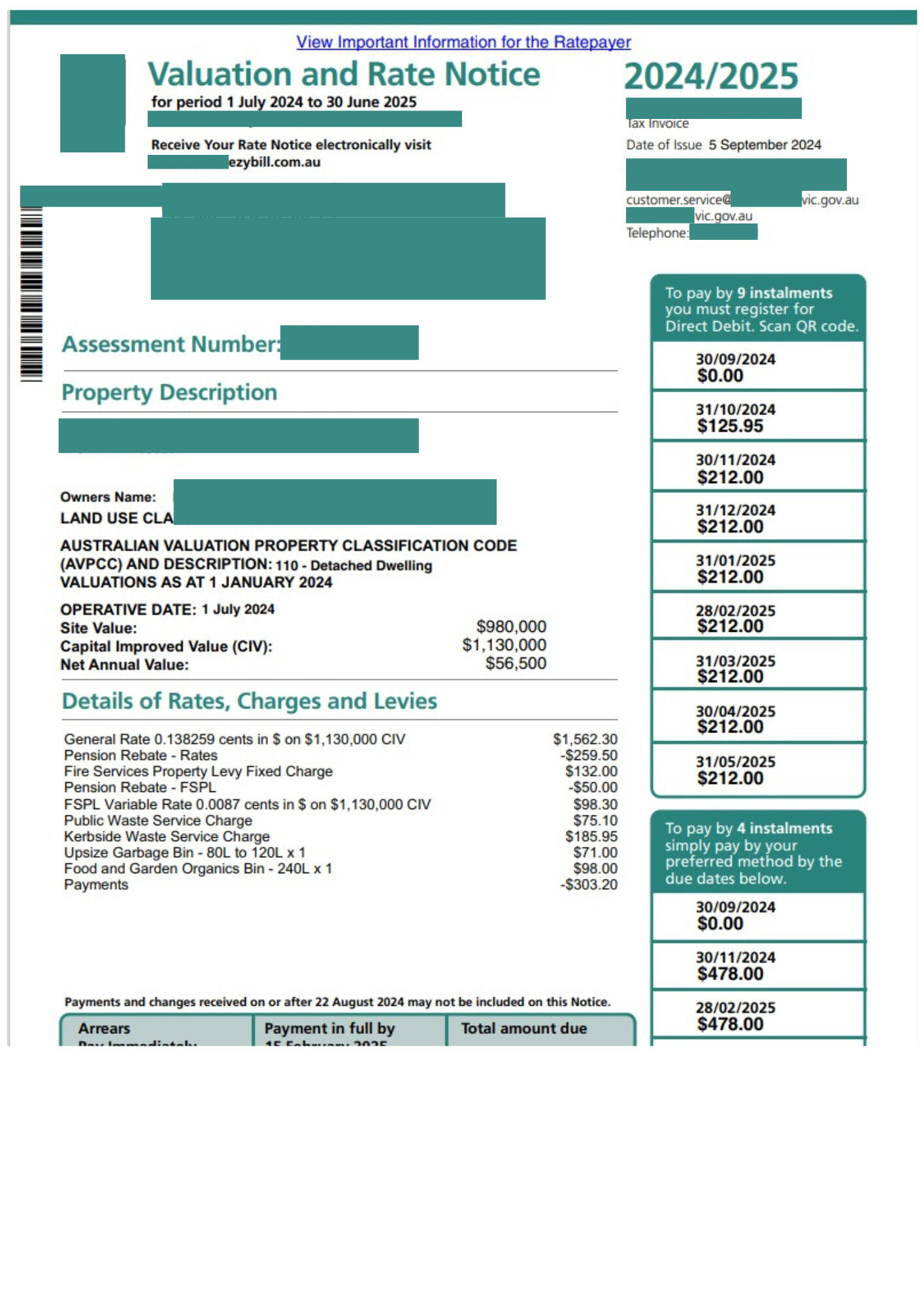
1. Problem
The original Rates Assessment Notice overwhelmed users with dense text, unclear hierarchy and scattered payment instructions. Elderly residents and ratepayers often struggled to understand their obligations — most importantly, how to pay — leading to an increase in call volumes and late payment penalties.
2. Approach
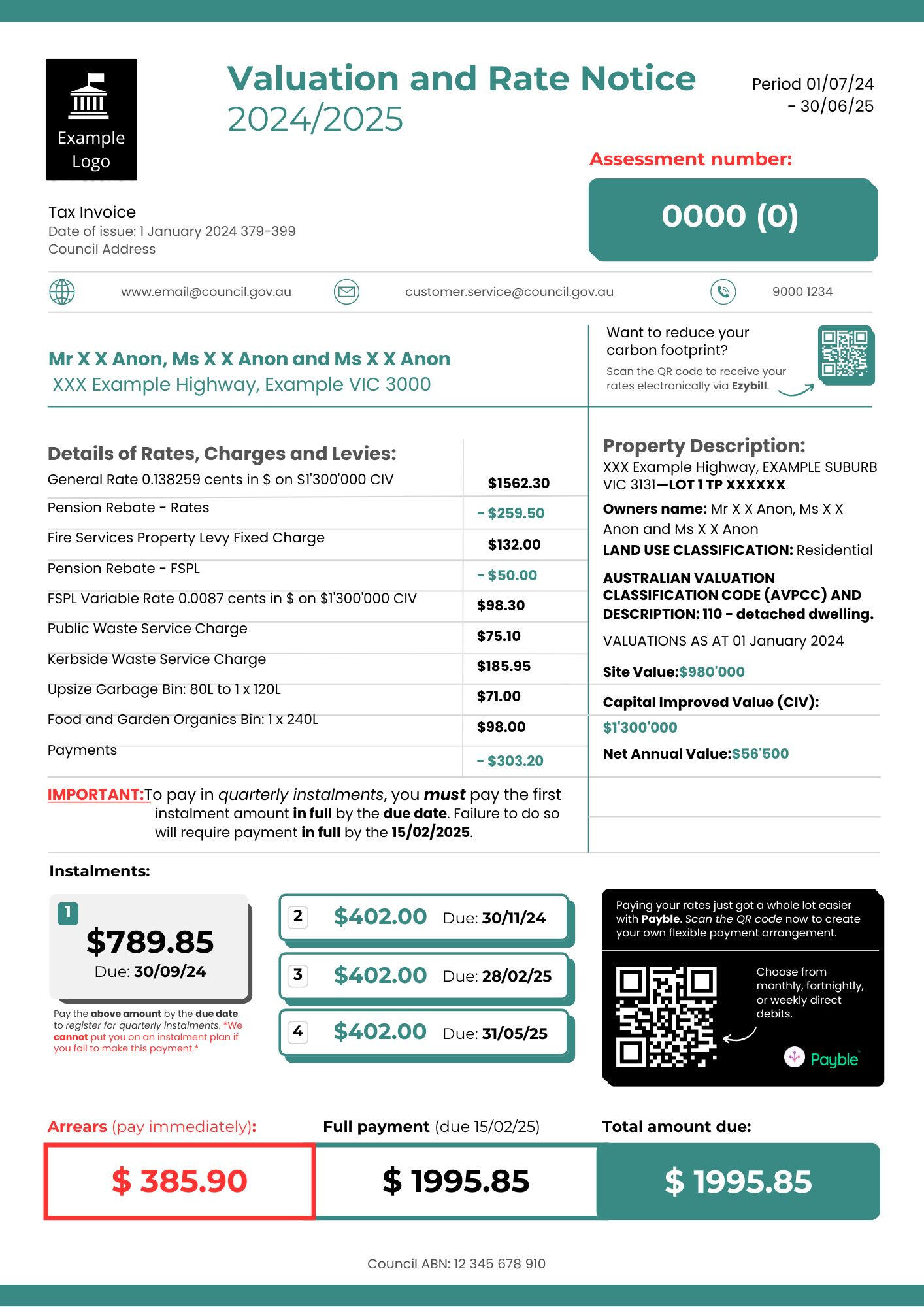
My goal was to redesign the notice to make it more intuitive, accessible and user-friendly by using the following design principles:• Prioritising critical actions by creating a clear visual hierarchy
• Logically grouping related information
• Reducing visual noise through added white space, iconography and colour coding
• Proactively addressing potential misunderstandings around obligations and consequences through the use of additional text
Left: Current Rates Assessment Notice.
Right: Proposed redesign.
3. Solution
• I simplified the layout, separating key information into logical groups.
• I restructured the page using a left-to-right logical flow that mirrors western reading habits.
• Cleaner, modern typography, subtle colour coding and iconography was added for better comprehension and skimming.
• Critical information was emphasised to proactively solve problems created by unclear communication — ultimately reducing administrative burden.
4. Outcome
The redesigned Rates Assessment Notice improves user comprehension, reduces cognitive load and could significantly reduce administrative support needs for Councils. Although conceptual, this redesign demonstrates my ability to apply human-centred design principles to government communications and improve user experience in real-world, high-stakes documents.
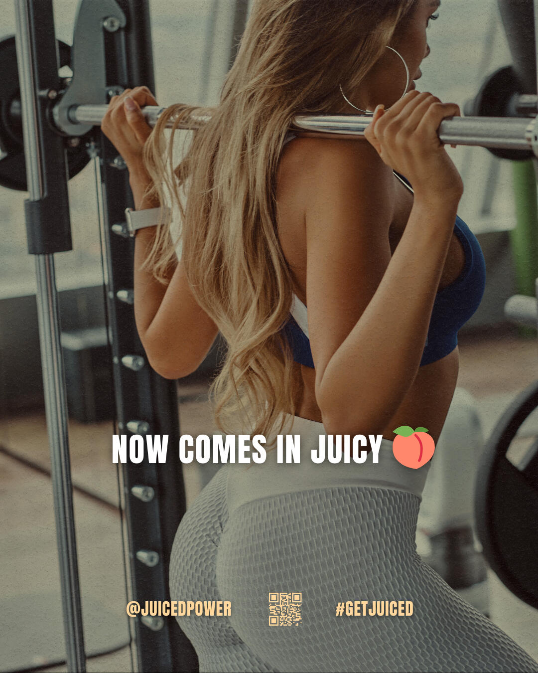
JUICED:
Rebrand and Strategy
1. Problem
When I met the owners of JUICED they faced a critical issue: Lack of Digital Presence — no online ordering system, no direct brand identity, no target demographic or alignment with customer lifestyles and a missed opportunity to expand beyond in-store purchases.In a highly competitive market, not having a clear brand experience, emotional resonance, or online accessibility was stalling growth and customer loyalty.
2. Approach
My goal was to help JUICED stand out by doing less—better.I collaborated with the owners to design a hyper-focused product line tailored specifically for fitness enthusiasts, with clear macros, nutrient density and purpose behind every blend.The branding channelled energy, freshness and performance—creating not just a juice bar, but a lifestyle hub for the local fitness community: university students, run clubs and boutique gyms—a market no one in the area had tapped into.


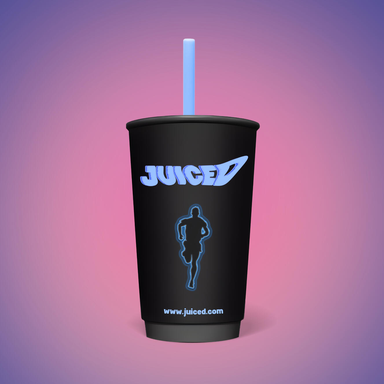

3. Solution
Website Concept: I designed a mobile-friendly website prioritising order-now functionality, clear product categories and a strong brand identity.Brand Strategy: Reframed JUICED from a generic smoothie bar into a fitness lifestyle brand catering to the vibrant local demographic through pre/post workout products, store redesign and targeted social media campaigns.Community Focus: Introduced loyalty programs, influencer collaborations and partnerships with local gyms and universities to build a strong, loyal community and repeat customers.Strategy: Developed a step-by-step strategy with tangible growth goals, including:• The introduction of a new menu
• Partnership outreach and collaboration with revenue-share incentives
• Contest ideas where participants could create their own smoothie
• Live events such as run clubs and wellness seminars
4. Outcome
While not fully implemented, the strategy showcases my ability to:• Think beyond design — into real business growth
• Blend branding, UX, marketing and emotional design seamlessly
• Create user-first experiences that feel fun, intuitive and resonant.This project demonstrates strategic thinking, user empathy and the ability to align design and marketing to tangible revenue opportunities.
Healing Anxiety:
Guided Journal
1. Problem
Many mental health resources are dense, clinical, or overwhelming for individuals dealing with anxiety.
There was a need for a gentle, self-paced, emotionally supportive tool that users could engage with safely and personally — without pressure to "fix themselves overnight."
2. Approach
I designed a guided journal, Healing Anxiety, focused on:
• User Experience Principles: Soft, inviting language, clear navigation, optional paths (skip prompts if needed), no guilt or "correct"
outcomes
• Emotional Design: Every page reduces cognitive and emotional load while inviting trust and vulnerability.
• Visual UX: Generous white space, clear typography, and accessible formatting to prevent overwhelm.
• Brand Strategy: Created a supportive publishing identity — 'Holding Close' — designed to feel nurturing, trustworthy and emotionally grounding for readers.
The Holding Close and POSTPARADISE websites are undergoing reconstruction.

3. Solution
Healing Anxiety: A structured but flexible emotional support tool, offering daily prompts, reflection exercises and creative expression spaces for users to visualise their thoughts and feelings.Holding Close Brand and Website: Developed clean, minimalist branding and a simplified sales funnel to drive sales.Series Plan: Positioned Healing Anxiety as the first in a planned series of 8 healing journals — creating continuity, brand loyalty and long-term engagement.
4. Outcome
User-Centric Emotional Support Tool: Provides a judgement-free, accessible resource for individuals managing anxiety.Brand Expansion Ready: Established Holding Close as a platform for future wellness products and emotional healing resources.Practical Business Impact: This book is designed to be monetised through both direct sales and scaled series releases, demonstrating product development thinking,
Original Digital Artworks
A visual and emotional study of what it means to be human in an increasingly digital world. These works explore memory, identity and emotional resonance through technology-infused visuals.Currently reimagining this into a broader creative brand—more soon.


A visual and emotional study of what
A visual and emotional study of what