A strong product with no positioning redesigned into a scalable brand system
No system. No growth.
The team at JUICED had a fantastic product, but with an overwhelming 50+ item menu and no clear market position, revenue relied on random walk-in traffic, averaging $150–$200 per day. The brand and in-store experience lacked consistency, and with no use of sales data and no defined audience, the team needed a new approach.
The team at JUICED had a fantastic product, but with an overwhelming 50+ item menu and no clear market position, revenue relied on random walk-in traffic, averaging $150–$200 per day.
The brand and in-store experience lacked consistency, and with no use of sales data and no defined audience, the team needed a new approach.

Approach
The focus was to reposition JUICED as a fitness-driven performance brand, supported by a mobile-first ordering system designed for speed, clarity, and post-workout behaviour.
The goal was not to expand the offering, but to simplify it and create a clear connection between product, audience, and experience.
Product
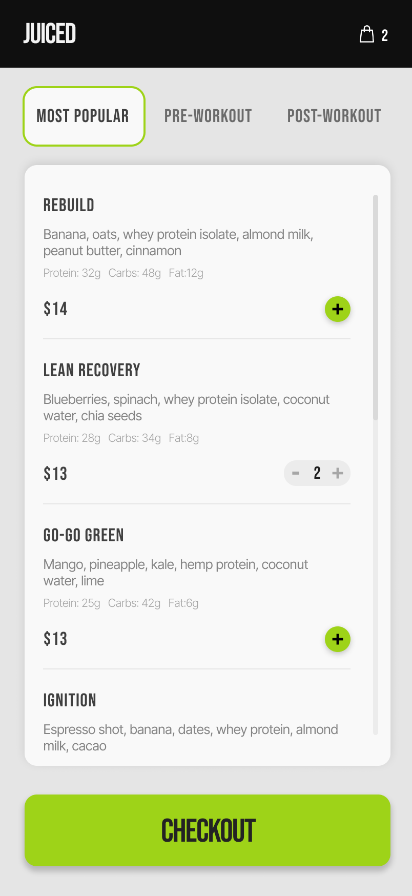
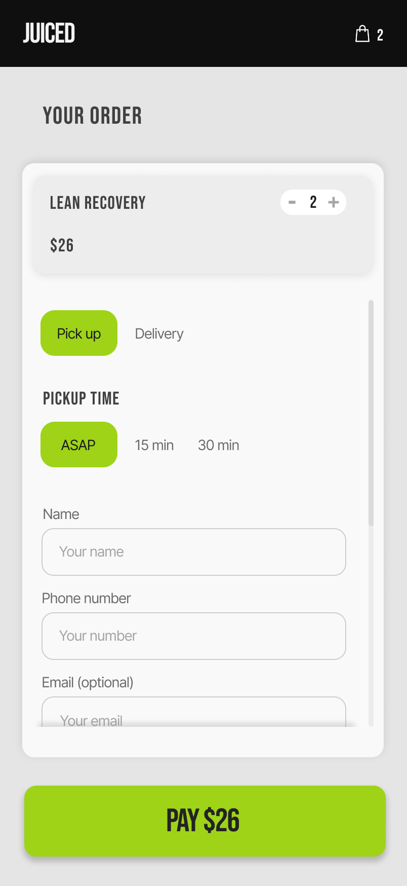
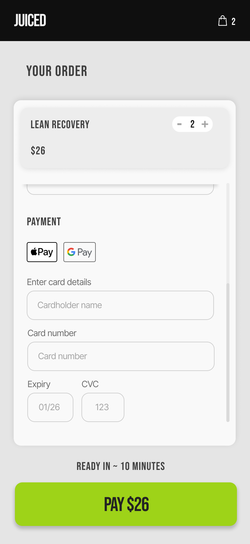
The product experience was redesigned around speed and clarity. A mobile-first flow, simplified navigation, and an ingredient-first menu reduced friction, while a streamlined checkout made ordering fast and intuitive.
The product experience was redesigned around speed and clarity. A mobile-first flow, simplified navigation, and an ingredient-first menu reduced friction, while a streamlined checkout made ordering fast and intuitive.
Approach
Every project starts by getting clear on what the business is trying to achieve, and what’s getting in the way. From there, I rethink the structure behind the product, then design an interface that makes the right actions obvious and easy.
1. Clarity
Before doing anything, we define what success actually looks like.
Then we look at what’s currently stopping that, whether it’s positioning, structure, or how things are being presented.
2. Rethinking the system
We look at how everything currently works, what’s unnecessary, what’s missing, and what needs to change.
From there, we shape a simpler, more focused system that creates clarity and direction.
3. Designing the product
The final step is building an interface that feels natural to move through.
Clear, easy to follow, and designed to help people take action without confusion or friction.
Outcome
A new direction was well received, and a 20% revenue share model was structured. Implementation did not proceed due to internal capacity and risk constraints.
The work surfaced the core issue: growth was constrained by a lack of clear positioning, an unfocused menu, and no defined target audience.