Rethinking how public systems communicate. A redesign of a government rates notice to reduce confusion, support demand and cognitive load.

Every rates cycle generated the same pattern.

Long call queues. Repeated questions. Confused customers. Staff spending hours explaining information that already existed on the page.

The notice had become normal because everyone was used to it.

Nobody had questioned whether the document itself was causing the problem.

The rates notice contained everything customers needed. It just didn’t communicate it.

Payment options competed for attention. Important information was buried in dense layouts, and the relationship between totals, instalments and due dates wasn’t immediately clear. Customers weren’t confused by council rates – they were confused by the way the information was presented.

Treating the notice as a user interface instead of a compliance document completely changed the design approach.

Clarity at scale: A redesigned rates notice built to answer the most common customer questions before they reached the call centre.

The redesign introduced clearer hierarchy, simplified language and a layout that separated critical information into logical groups.

Rather than expecting customers to interpret the document, the document was redesigned to guide them through it.

The objective wasn’t simply to improve readability.

It was to reduce avoidable support calls, increase confidence and make a complex public service feel easier to navigate.
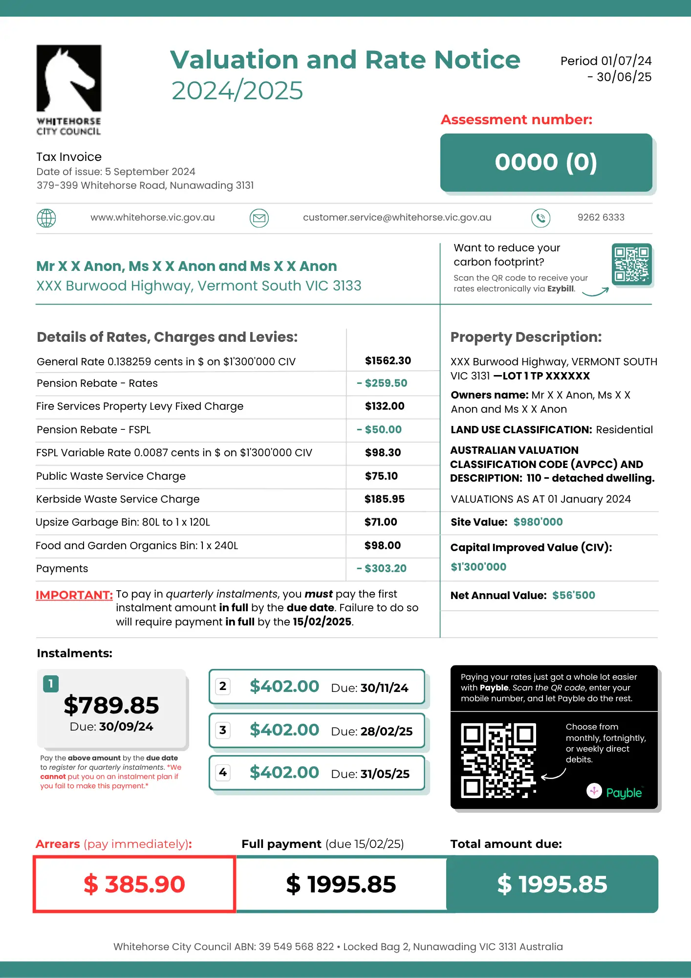
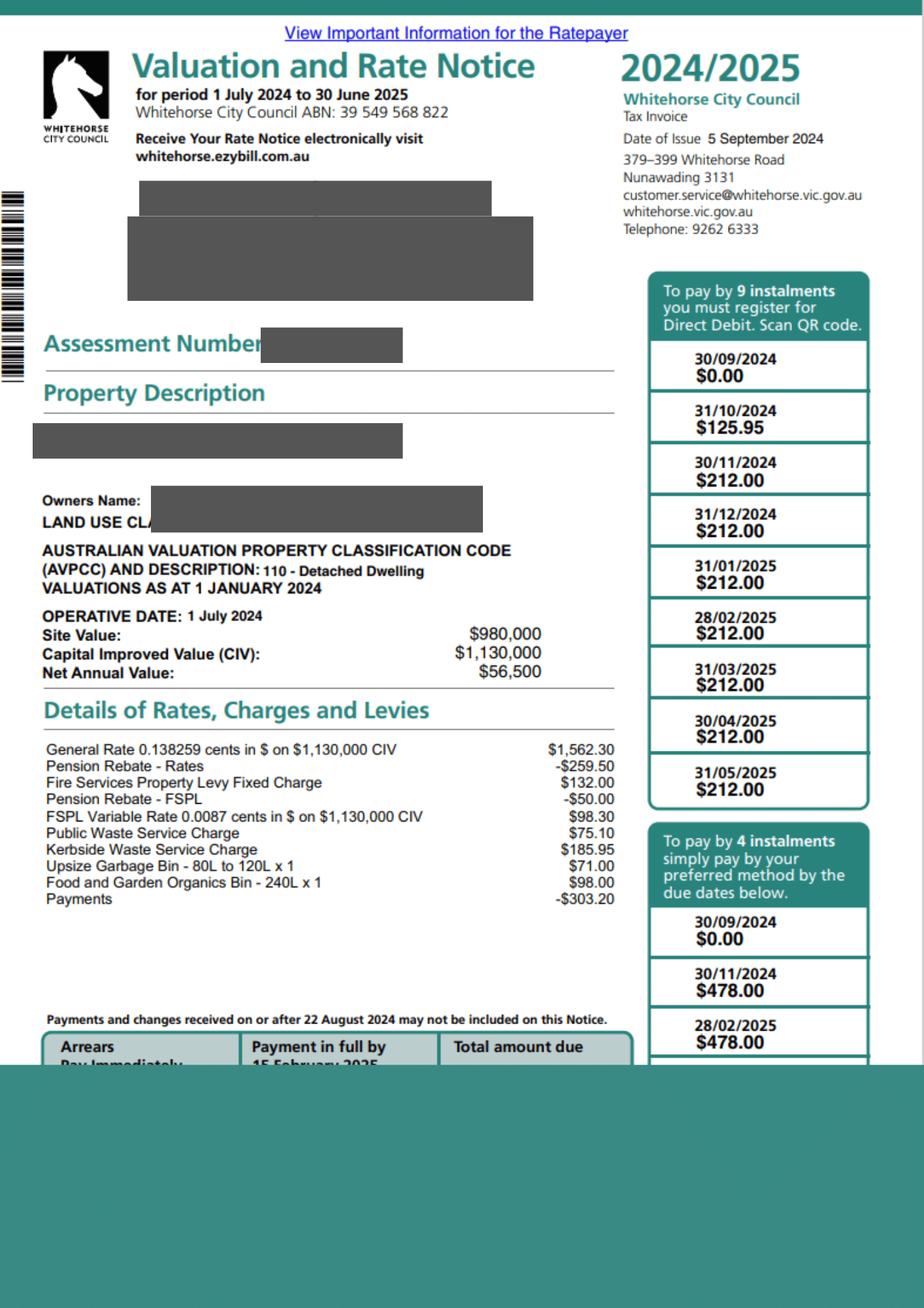
The proposal demonstrated that a communication problem could be addressed through design rather than additional staffing, training or customer support.

Internal review strongly supported the direction, validating improvements to clarity, structure and comprehension while reinforcing the broader opportunity to reduce operational friction through better communication design.

Complexity doesn’t have to feel complicated.

Open menu