Building a Concept-Led Cinematic Studio Using Brutalist UX and Emotional Contrast
The Project
Designed and launched the website for BER–66, a concept-led cinematic studio producing films and campaign systems for founders, artists, and companies. The brief was to create a public-facing identity that positioned the work seriously without explaining it, and converted the right clients without chasing volume.
Designed and launched the website for BER–66, a concept-led cinematic studio producing films and campaign systems for founders, artists, and companies. The brief was to create a public-facing identity that positioned the work seriously without explaining it, and converted the right clients without chasing volume.


Approach
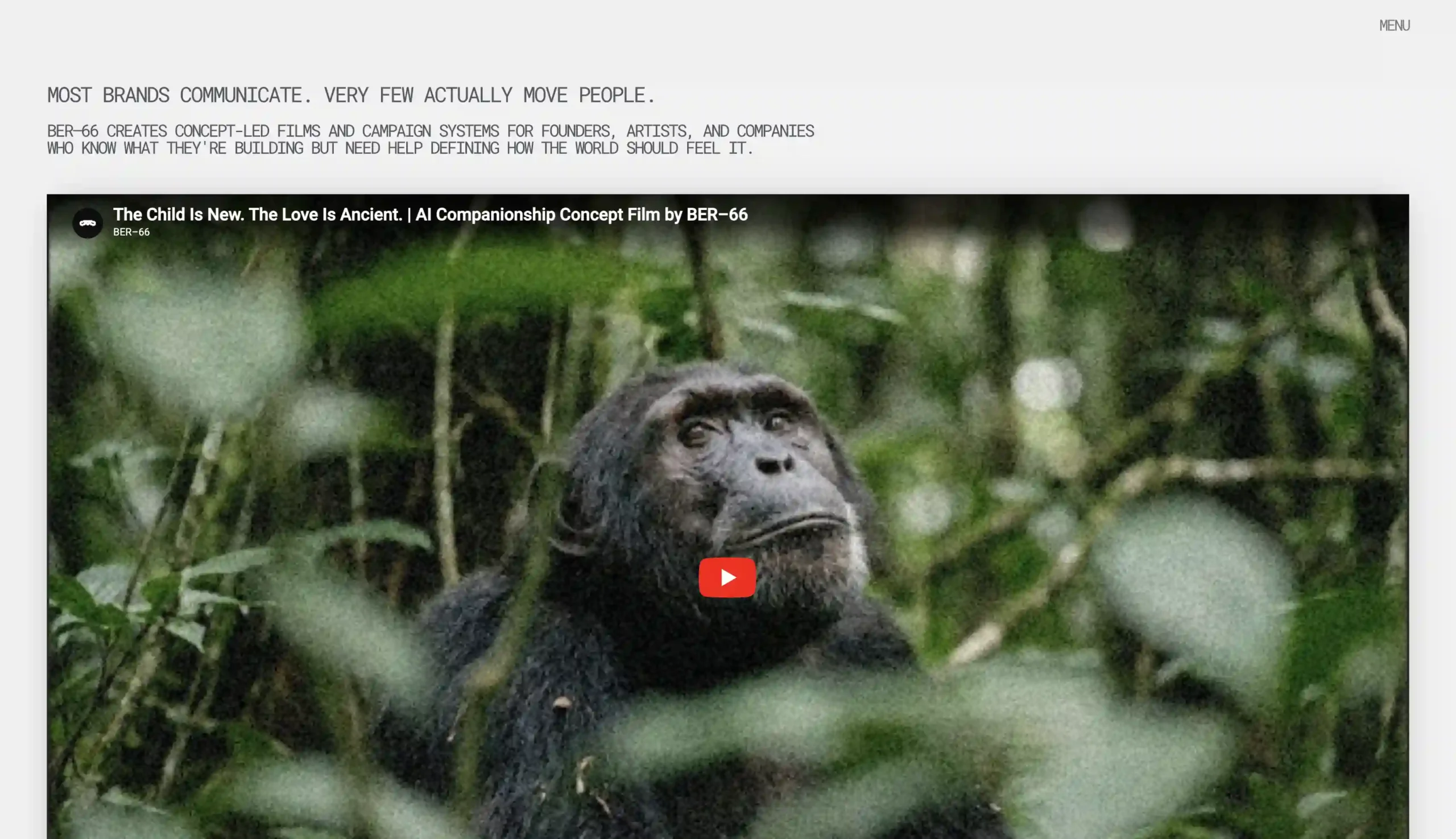
The central design tension was intentional: the website is cold, archival, and machine-like, while the work it houses is deeply human. This contrast is not aesthetic, it is conceptual. BER–66 takes its name from a character in the novel Robot, who spends the narrative trying to determine whether he is human or machine, and never finds out. The container is clinical. What lives inside it is not.
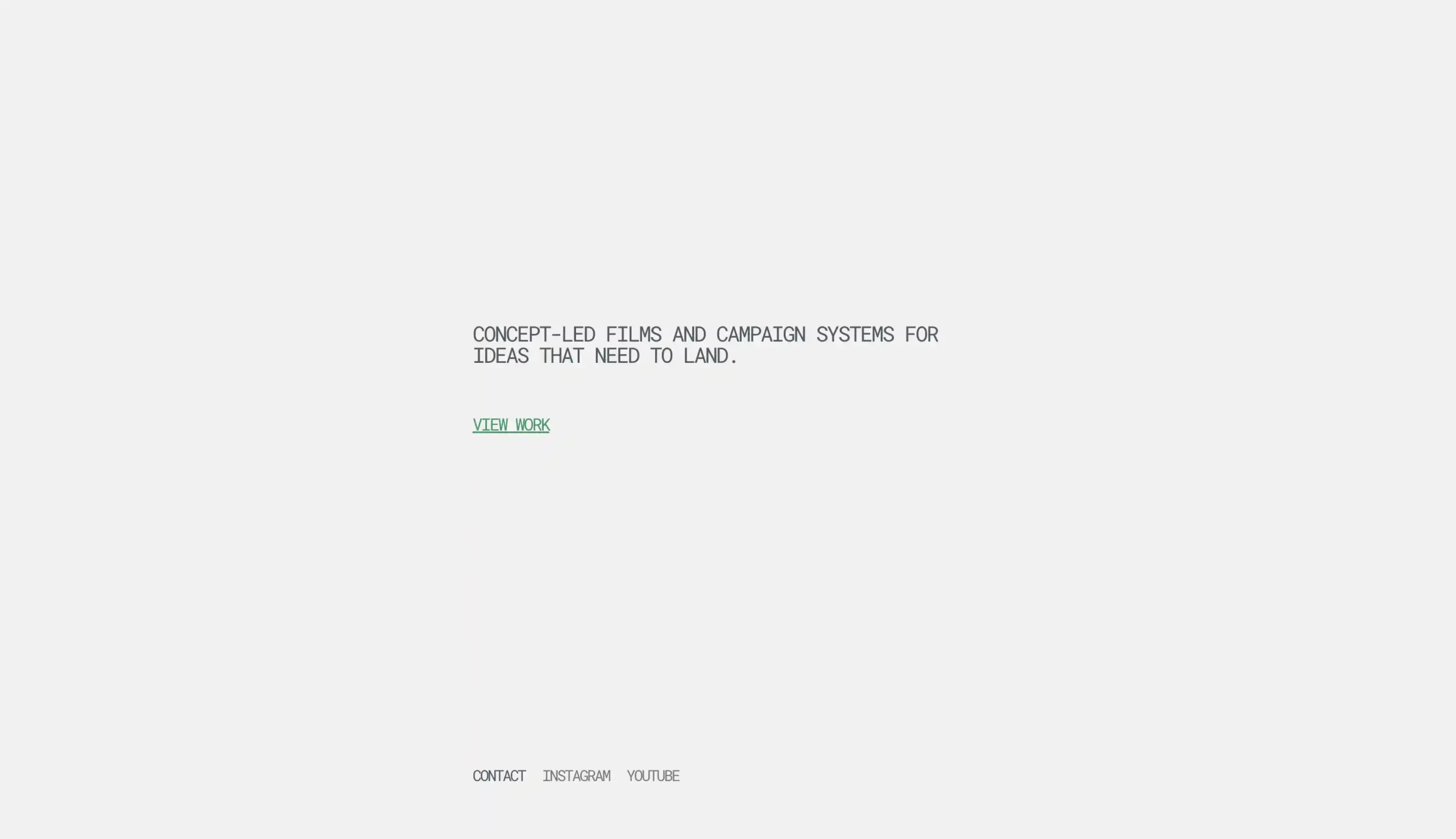
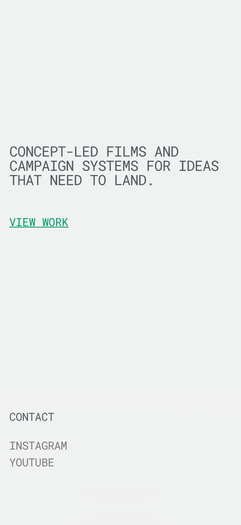
Minimalism was used as a confidence signal rather than a stylistic choice. The homepage is a single line of copy and one CTA, no hero image, no reel, no scrolling manifesto. The service accordion makes the full depth of the studio’s capability visible without reading like a sales document. The footer pricing: Projects start at $1,500 USD, functions as a client filter, removing low-intent enquiries and signalling professional scope and value. The site functions as a trust anchor for clients who encounter the work elsewhere and want to look deeper before reaching out.
The central design tension was intentional: the website is cold, archival, and machine-like, while the work it houses is deeply human. This contrast is not aesthetic, it is conceptual. BER–66 takes its name from a character in the novel Robot, who spends the narrative trying to determine whether he is human or machine, and never finds out. The container is clinical. What lives inside it is not.
Minimalism was used as a confidence signal rather than a stylistic choice. The homepage is a single line of copy and one CTA, no hero image, no reel, no scrolling manifesto. The service accordion makes the full depth of the studio’s capability visible without reading like a sales document. The footer pricing: Projects start at $1,500 USD, functions as a client filter, removing low-intent enquiries and signalling professional scope and value. The site functions as a trust anchor for clients who encounter the work elsewhere and want to look deeper before reaching out.
Product Architecture
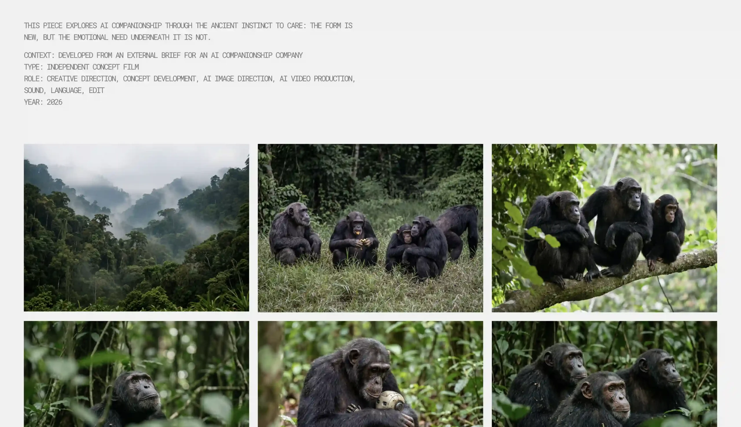
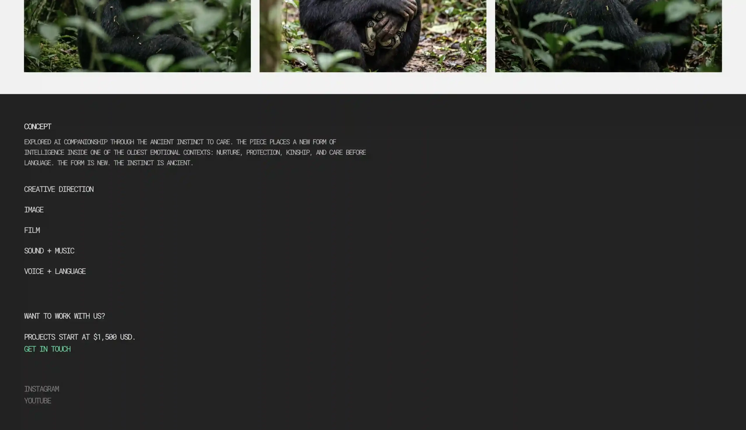
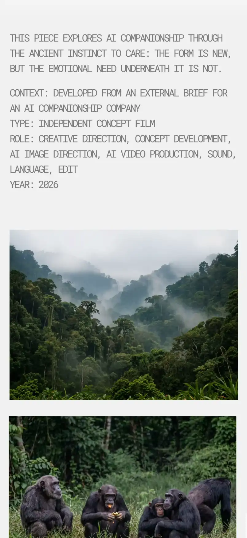
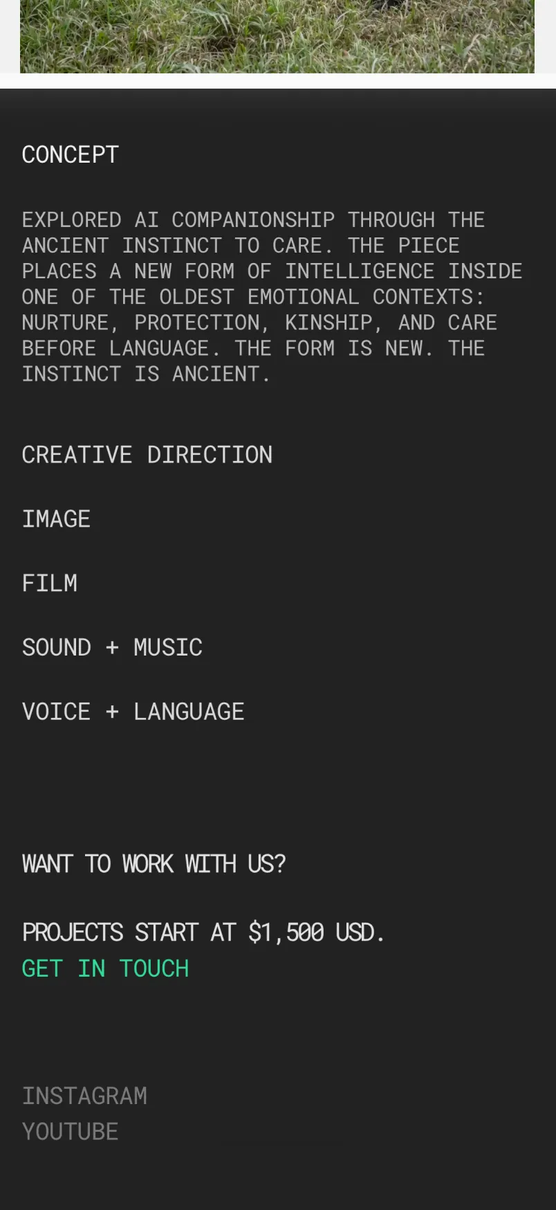
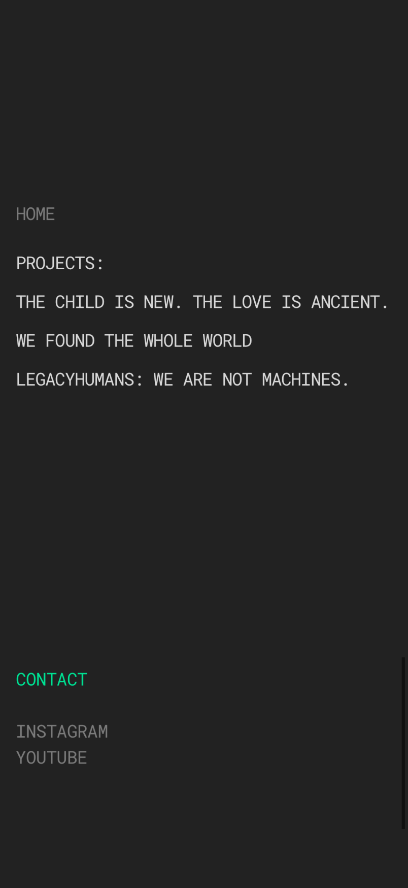
Monospace uppercase typography throughout, reinforcing the archival quality. Background shifts between light and dark across pages, creating a felt transition between the studio exterior and the work itself. No animations, no decorative elements, every interaction text-based and direct. Individual project pages are structured as production documents: concept summary, stills, services rendered, and a closing CTA, reinforcing the studio as a serious, process-led operation.
Monospace uppercase typography throughout, reinforcing the archival quality. Background shifts between light and dark across pages, creating a felt transition between the studio exterior and the work itself. No animations, no decorative elements, every interaction text-based and direct. Individual project pages are structured as production documents: concept summary, stills, services rendered, and a closing CTA, reinforcing the studio as a serious, process-led operation.
Outcome
A live, fully deployed studio website built around a single conviction: restraint, used correctly, is a stronger signal than explanation. The site presents the work seriously and makes the next step obvious for anyone ready to take it.